A Shopify website redesign for a children’s clothing boutique called Bellibooboutique, based here in Elk Grove.
View the website here.
The Project -
in focus
Home (Before)
Home (Before)
Home (Before)
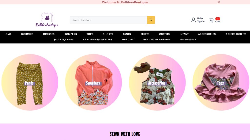
The Home Page (Before)
It was inconsistent. No simple and aligned color scheme. The website was all over the place with a menu that was overwhelming and confusing. And it didn’t immediately tell me what it was about.
Home (After)
Home (After)
Home (After)
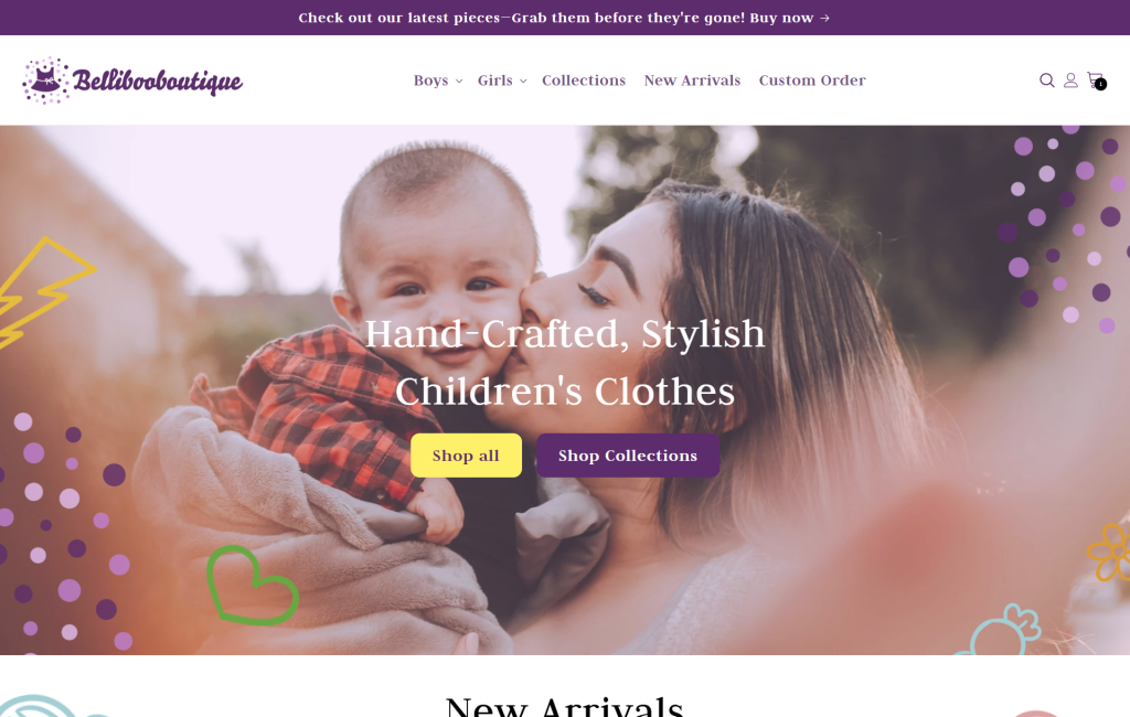
The Home Page (After)
With the new logo came a website with an identity that was cohesive. An organized menu that was clear, simple and easy to understand. With imagery and words that quickly and clearly told you what the website was about. Children’s clothes.
Mobile Home (Before)
Mobile Home (Before)
Mobile Home (Before)
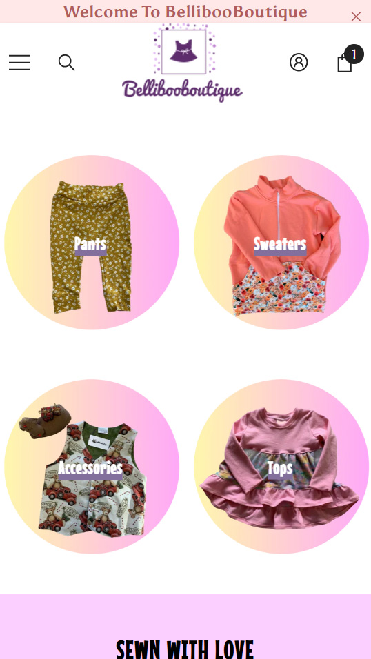
The Mobile Home Page (Before)
The mobile home page followed the same idea of the desktop. Inconsistent theme, colors, and branding. However, it did a little better in usage of space unintentionally. I was also told by the owner that the dropdown menu didn’t work on mobile.
Mobile Home (After)
Mobile Home (After)
Mobile Home (After)
The Mobile Home Page (After)
The new mobile home page brought immediate call to actions and told the visitor what the website was about. Websites, especially e-commerce websites should be made for mobile first as most people buy online, on the go, on their phone. Surprisingly though, this store’s visitors were overwhelmingly on desktop computers and that has to do with the demographic. Stay at home moms and grandmothers.
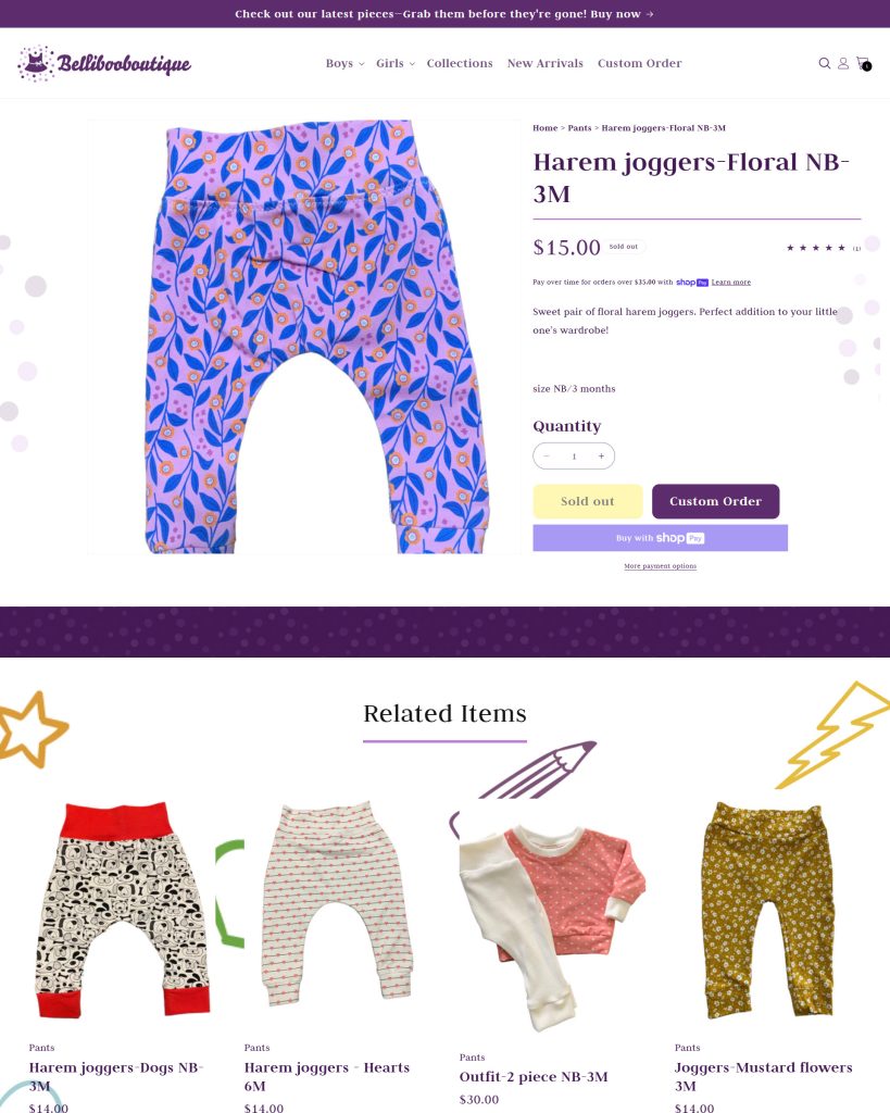
Product Page (Before)
Product Page (Before)
Product Page (Before)
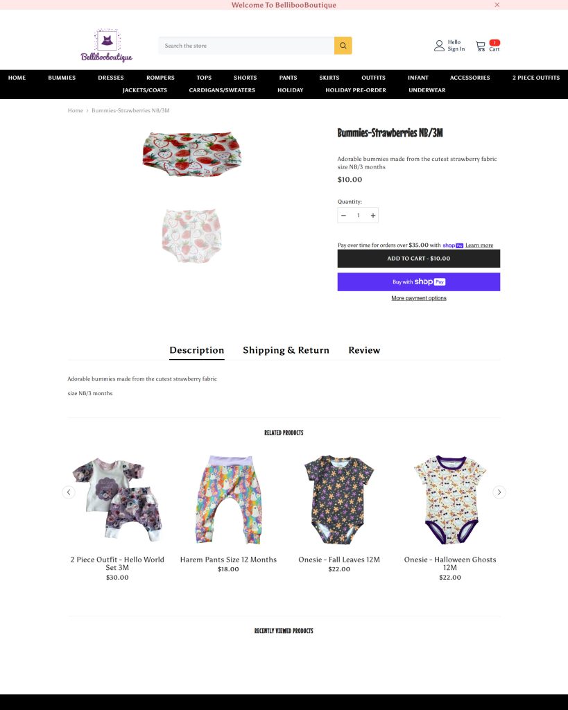
The Product Page (Before)
The original product page was broken. It smashed images and did not properly display the product photos. Making it very difficult for visitors to get a good look at the product and making it even more difficult for them to want to purchase it.
Product Page (After)
Product Page (After)
Product Page (After)
The Product Page (After)
The new product page completely fixed the broken image issue and added even more to help the store. We added ratings to the product page which were missing. And we added a new feature that would allow customers to custom order the products they liked in a size that fit their child.
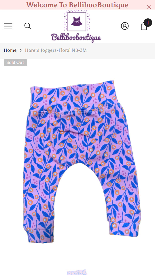
Mobile Product Page (Before)
Mobile Product Page (Before)
Mobile Product Page (Before)
The Mobile Product Page (Before)
Now originally, this page was broken on mobile as well. However, I had quickly went into the Shopify store to fix it so it worked properly while I was in the process of redesigning of the website.
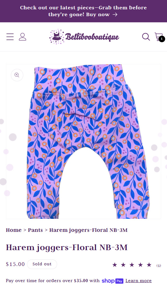
Mobile Product Page (After)
Mobile Product Page (After)
Mobile Product Page (After)
The Mobile Product Page (After)
The new mobile product page featured an image shown right up front in high quality with additional information for immediate context. The stars for rating, price and name of the product. Customers can also swipe to see more images.
The New Logo
To find the new logo I designed for Bellibooboutique, click the button below to go to the case study surrounding that.
The Project - gallery
Think we'd be a good fit?
I’d love to hear from you. If you’re local, let’s grab lunch! If not, just fly me out. Look forward to meeting you! Cheers!