
The Project - in focus
- The Birth
- The Birth
- The Birth
The Birth of Jose's Landscaping
Jose’s Landscaping took on a complete brand with heavy inspiration from nature, landscaping and Jose himself. I formed a visual identity that was both friendly, personal, inviting and premium. The entire identity for Jose’s Landscaping was sketched and hand drawn then vectorized and perfected. Interestingly enough, the owner Jose did not have the greatest signature so I formed an elegant one from scratch.
Jose, the owner, constantly emphasized quality and getting it done right and extremely well. He did good work and that was everything to him. And this was a small, independent business ran by one man so I wanted those elements to be the driving forces. Quality and personal. Personal being something a large landscaping company couldn’t provide. Nor the level of care that comes with a sole owner who puts his reputation behind every piece of work he does.

- The Shield
- The Shield
- The Shield
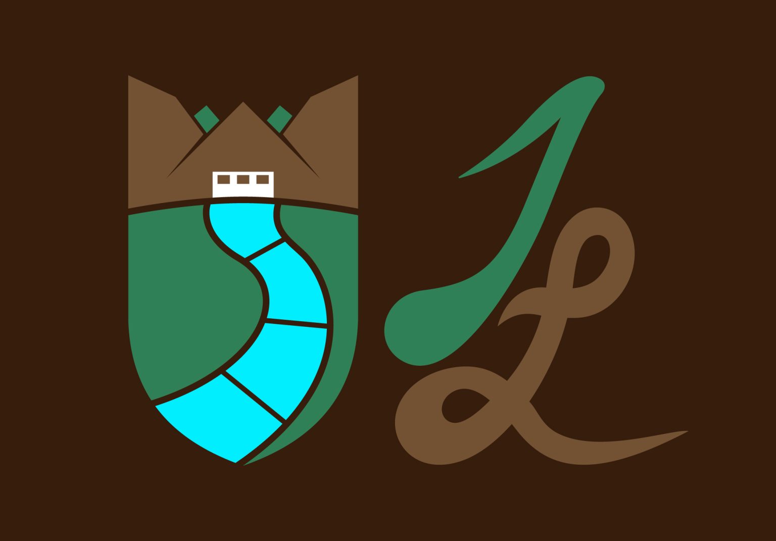
The Shield
Shields are a symbol of strength. Often associated with medieval times where strong castles made of stone existed.
The shield is split into pieces allowing for the visual of a home with a garage and a driveway or sidewalk going through a green lawn. The shield combines both curves and sharp straight lines emphasizing the natural and organic nature of landscaping and the rigid, pointy nature of concrete. The top of the shield separates off to form a crown that also serves as the home.

- The Monogram
- The Monogram
- The Monogram
The Monogram
Making people’s homes beautiful and increasing their property value… Creating a space for families to live and relax…
Landscaping is a work of art and that’s how we saw it. Every artist needs a signature and their initials. The signature was part of a broader branding play that would differentiate Jose’s Landscaping from all other landscaping companies. Landscaping that had a brand. A stamp of approval. A certification. A mark of quality. That was the signature. All with the natural curves of nature and the smoothness of a signature that felt personal.
- The Stamp of Quality
- The Stamp of Quality
- The Stamp of Quality
The Colors
For the colors, I choose a combination of green and brown to form a very organic image that was nice, warm, and cozy.
Then, I added a bright, complimentary accent of teal to be my pop that made it all jump out at you and catch the eye.
Together, A Monogram Mark—A Stamp of Quality
Together, we have the foundation for strength, resilience, long lasting and quality with the personal touch of an artist.